
Brand promise
“At Carlton Dental, our patients get the best dental care in the community and we are proud to call Carlton, OR our home. The whole Carlton Dental team works hard to offer the best dental service to our neighbors, making sure our patients feel proud and comfortable before, during and after their dental appointment.”
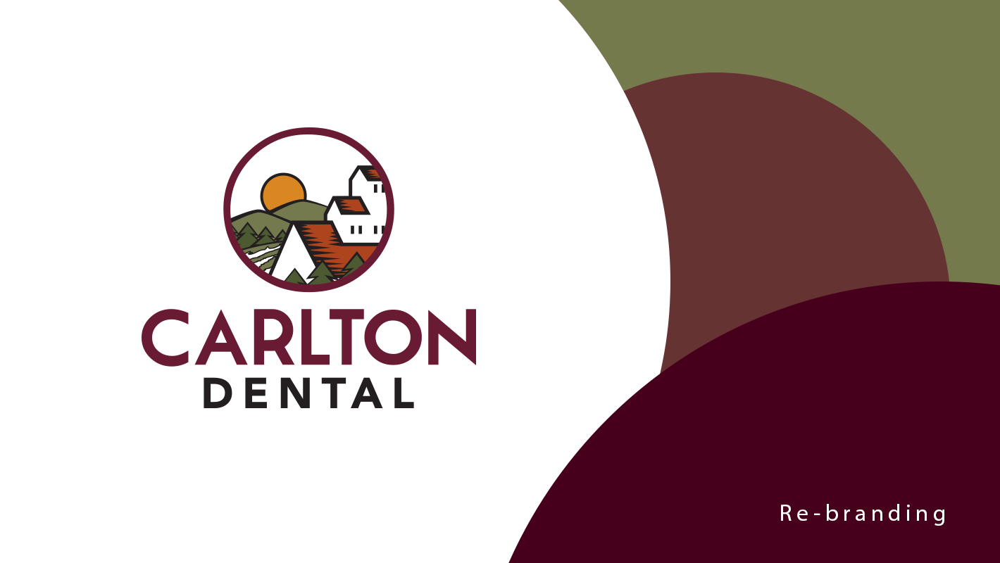
Concept
With the redesign, we wanted to create a representation of the friendly, tight-knit community of Carlton, OR, the home of the dental practice. The icon is an allusion to the patients, families, and traditions that have been pass on through generations and generations.

Promesa de la marca
“En Carlton Dental, nuestros pacientes obtienen el mejor cuidado dental en la comunidad y estamos orgullosos de poder llamar Carlton, OR nuestro hogar. Todo el equipo de Carlton Dental trabaja arduamente para ofrecer el mejor servicio dental a nuestros vecinos, asegurando que nuestros pacientes se sientan tranquilos y cómodos antes, durante, y después de la cita dental”.
Concepto
Con el rediseño, nuestro objetivo era crear una representación de una comunidad amigable y unida de Carlton, OR, hogar de la oficina dental. El ícono es una alusión a los pacientes, familias y tradiciones que se han transmitido de generación en generación.


ESP: White circle: T-shirt design; Orange circle: Stationery; Green circle: New patient forms and referral pad; Yellow circle: Pens.
ENG: Círculo blanco: Diseño de camiseta; Círculo naranja: Papelería; Círculo verde: Formas para nuevos pacientes y referencias internas; Círculo amarillo: Plumas.

ENG: Every Door Direct Mail, flyer design. ESP: Correo Directo, diseño de flyer.
Thank you! ↔ ¡Gracias!
Team:
Arvory Marketing
Arvory Marketing
Credits:
Arvory Management Group, Todd Murray and Elliott Omlin
Arvory Management Group, Todd Murray and Elliott Omlin


